Work Bar 🚧

Overview
The Work Bar communicates the status of an object, and surfaces key controls to the user. The Work Bar enables users to move through an application with a clear understanding of the status of what they are working on and the primary actions associated.
Usage
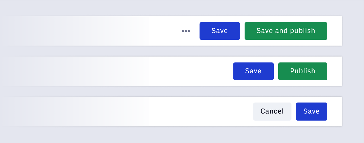
The design and functionality of the parent application will determine the primary actions and statuses reflected in the Work Bar. To optimize a user's experience, no more than three button elements should be placed on the Work Bar, additional actions should be kept in an Overflow Menu.
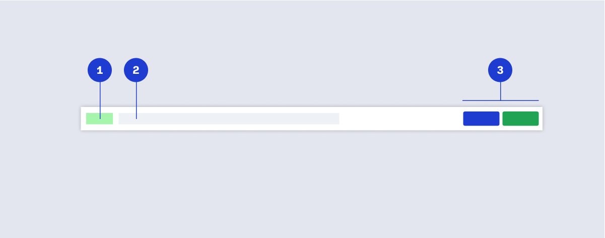
Component structure

- Badge (status)
- Title of content
- Primary actions
Interactions
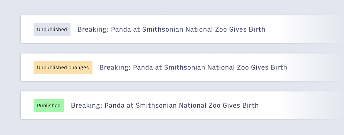
 Statuses are shown in the form of a Badge. The status reflected in the Work Bar should provide the user with a clear indication of the state of the object they are working on. Status’s can be determined by the use case and needs of the parent application.
Example: Active, Inactive, Archived or Unpublished, Unpublished Changes, Published
 The use case of the parent application will determine the buttons shown in the Work Bar. The buttons should reflect the primary and secondary actions associated with the UI. Additional actions can be listed in the Overflow Menu. The Work Bar should not contain more than three buttons.
Accessibility
The Work bar contains primary actions for the page and should be high in the tab order. When using the tab key to navigate elements, the order should be from most important, to least important. Generally, tab orders start at Arc Navigation, then the individual application navigation, and then into the Work bar if present. Then to the rest of the page.