Page layout
Overview
Consistent page layouts create visual structure, helping the user identify key areas of the interface. Arc Publishing has several common layouts and configurations. This documentation outlines key principles of this pattern.
Pattern structures
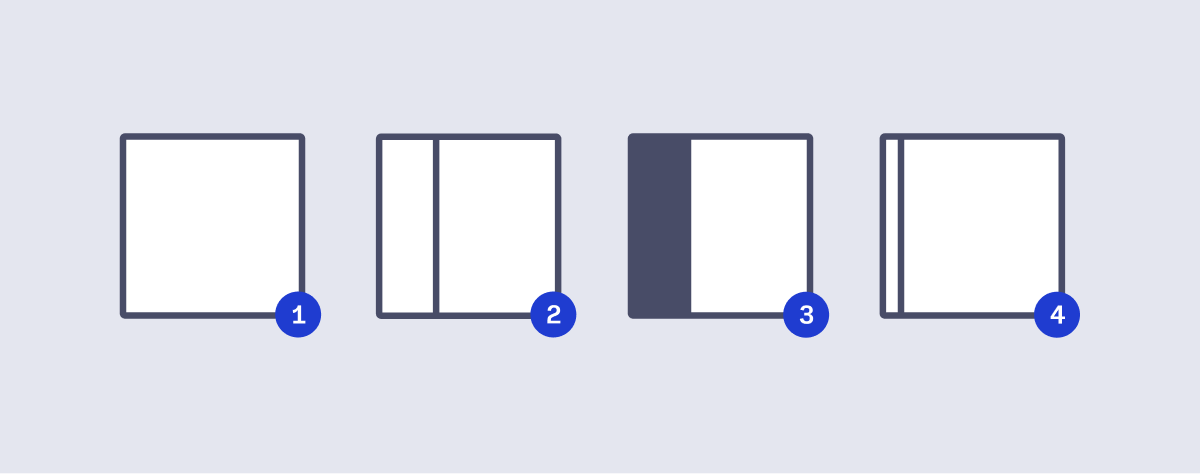
- Full-Width Content Area
- Fixed-Width Sidebar - A fixed width sidebar configuration with the content area.
- Arc Navigation Side Menu- The side navigation of Arc Publishing is the same width as the Fixed With Sidebar
- Collapsible Sidebar - A Fixed Width Sidebar that can be collapsed off-screen. A portion of the sidebar, with an icon button, remain in-view, allowing user to toggle the sidebar back on-screen.
Usage
Not all screens make use of a page layout defined here. There may be exceptions for certain screens depending on the application.
Content padding
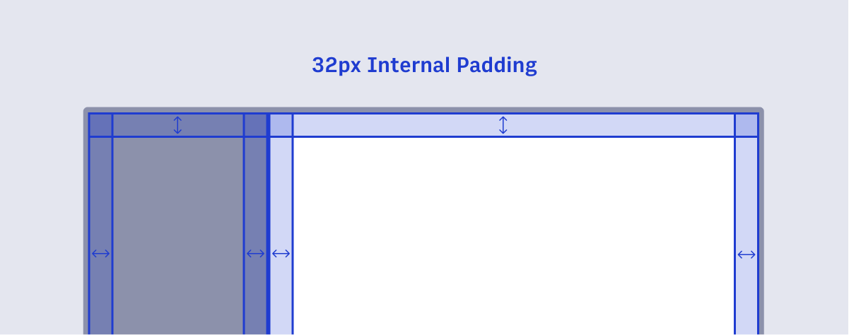
For consistent visual padding on page containers, the internal padding is recommended to be set at 32px. This guarantees as users navigate throughout the product suite, that all left and right margins are flush and consistent, page-to-page.
Sidebar sizing
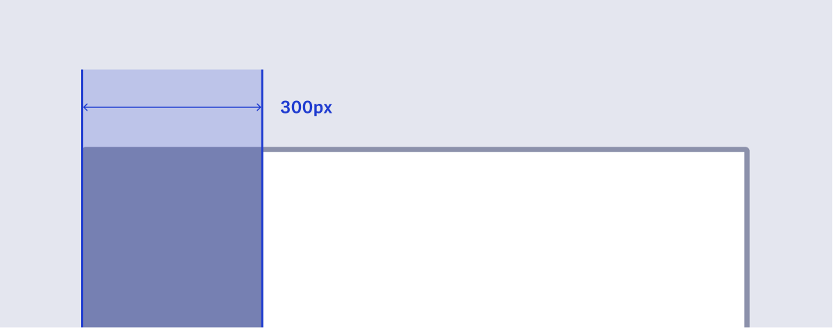
The Sidebar & Arc Navigation Side Menu are both a fixed-width size at 300px. This ensures each sidebar has enough room for content, forms, and other elements to fit comfortably inside.
Collapsible sidebar control (charm bar)
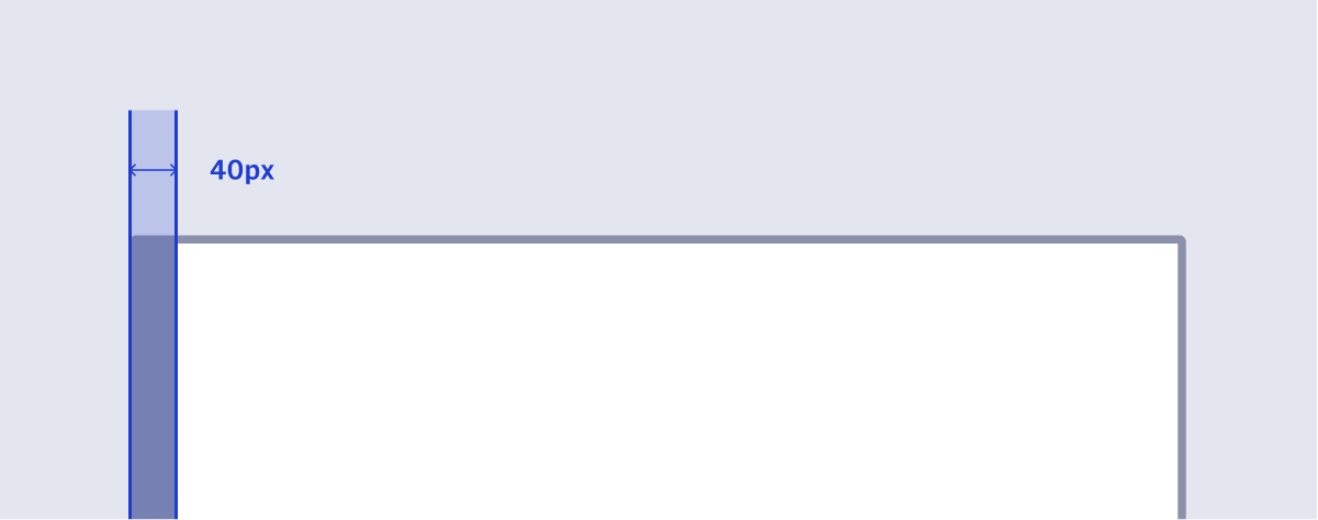
Some sidebars can be collapsed off-screen. These bars leave behind a portion of their background color, along with an icon (often referred to as a Charm Bar). This portion of the sidebar is recommended to be 40px wide.
Collapsible sidebar control & sidebar
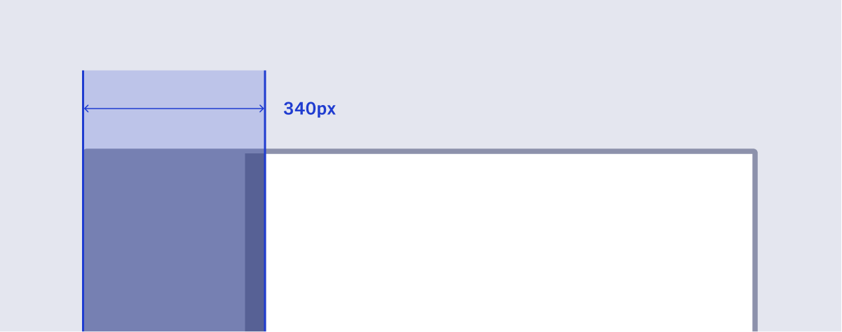
When a collapsed sidebar is revealed, it’s width (300px) and the charm bar (40px) create a width of 340px. This ensures that content in a collapsible sidebar still enjoy the same real estate as a static sidebar.
Charm bar on right edge

In some configurations, like in Composer, the charm bar is fixed to the right of the screen.