Checkbox 🚧
- Usage
- React
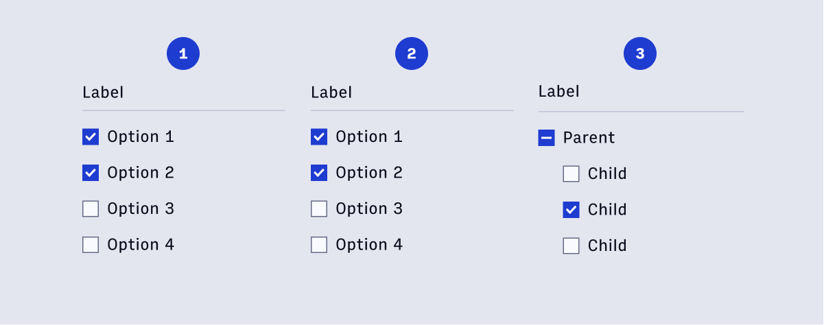
Checkboxes are used for a list of options where the user may select multiple options, including all or none. Use checkboxes when the list of available options are less than 8. By Default, all options should be unselected.
The click target should be both the checkbox itself and the accompanying text.
Component structure
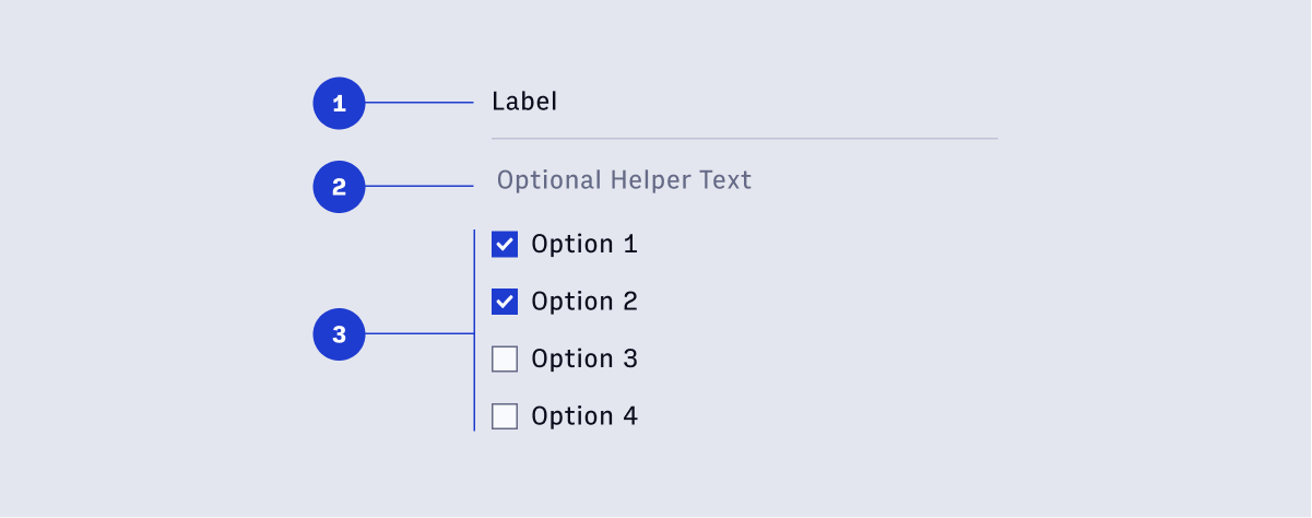
Usage
Checkboxes allow for 3 states:
- Selected
- Unselected
- Indeterminate
The Indeterminate state is applicable when checkboxes are organized in a hierarchy. If only a few of the child options are selected the state is indeterminate.
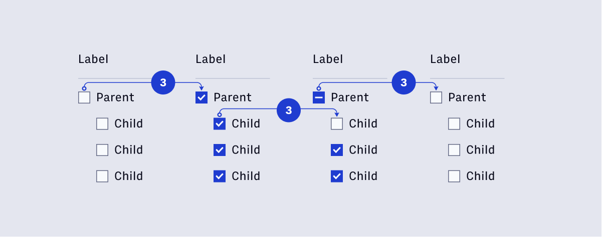
- When Selecting the parent checkbox, all child checkboxes are selected.
- If a child checkbox is unselected, the parent checkbox’s state is indeterminate.
- Selecting an Indeterminate checkbox will deselect all child checkboxes.