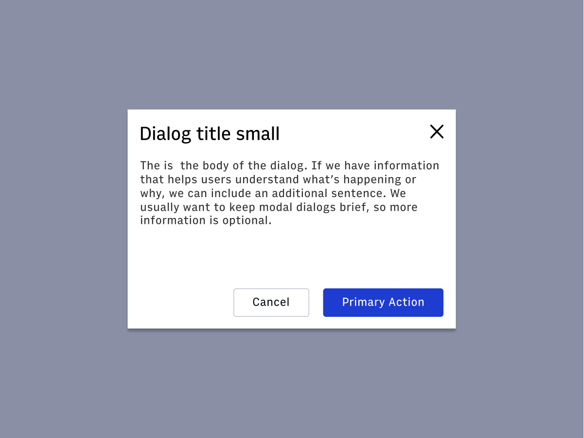
Dialog
overview
 A dialog is a conversation between the platform and the user. Dialogs often requests information or an action from the user. A dialog appears on top of the main interface typically in the form of a modal. A dialog disables the main content until the user explicitly interacts with the dialog.
- Usage
- React
note
Before using the dialog, verify you aren't looking for the alert dialog. Typically, the alert dialog pattern forces the user to choose one of the provided actions in order to close. The dialog can be closed by clicking outside of the dialog, clicking the 'x', or pressing escape. For more information on these patterns, see the WAI-ARIA guides.
Import
Arc UI exports 4 dialog related components:
DialogDialogTitle- provides font styling for the headingDialogBody- container for non-title, non-footer contentDialogFooter- flex container for action buttons--there should be at least two buttons
import { Dialog, DialogTitle, DialogBody, DialogFooter,} from '@wpmedia/arc-ui-dialog'Usage
info
Dialog is heavily based on the Reach UI Dialog, taking the same props as documented on their website as well as those below.
| Props | Description |
|---|---|
size(optional) | "small" | "medium" | "large" = smallSpecifies one of three dialog sizes |
DialogBody and DialogTitle
Both compose the Box component and take all the same props as Box