Icon
Overview
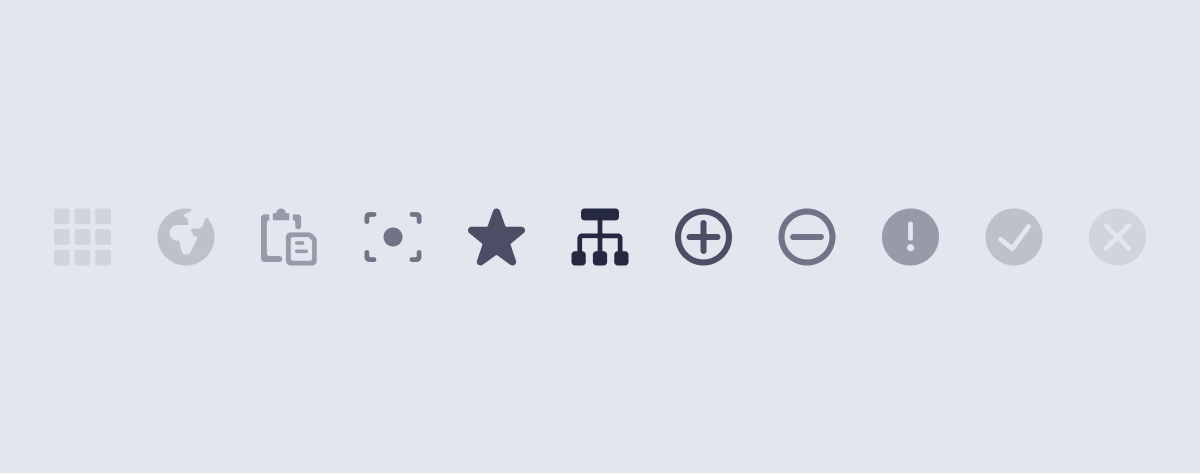 Icons are a visual language of their own. When used with purpose, icons help foster clarity and build understanding as the user navigates throughout the experience. Arc Design System’s icons are released to create a tighter icon implementation across the platform.
- Overview
- React
Import
import { Icon } from '@wpmedia/arc-ui-icon'Usage
The Icon component returns an <svg> tag with corresponding icon path and labels.
caution
Avoid adding event handlers directly to an Icon component. If you need a clickable icon, use IconButton instead.
interface IconProps
| Props | Description |
|---|---|
color(optional) | undefined | string = currentColorConsider using currentColor before using this prop |
desc(optional) | undefined | string = ''Custom accessibility description (more info) |
name | "ellipsis" | "warning" | "success" | "danger" | "publish" | "filter" | "filterWebsite" | "trash" | "arrowUp" | "arrowDown" | "arrowLeft" | "arrowRight" | "checkmark" | "close" | "copy" | "editDisplaySettings" | "expandArea" | "focalPoint" | "gridView" | "gridViewLarge" | "gridViewMedium" | "gridViewSmall" | "listView" | "maximizeGroup" | "minimizeGroup" | "moveToBeginning" | "moveToEnd" | "moveToGallery" | "removeImage" | "coverImage" | "openColorPicker" | "search" | "add" | "addInternalNote" | "chevronDown" | "chevronLeft" | "chevronRight" | "chevronUp" | "date" | "download" | "duplicate" | "edit" | "gallery" | "help" | "hide" | "photo" | "pitch" | "playController" | "playThumbnail" | "preview" | "refresh" | "settings" | "task" | "time"Name of the desired icon. The allowable names consist of all available icons. |
size(optional) | undefined | string = smallSize scale value |
title(optional) | undefined | string = each icon contains a default titleCustom accessibility title (more info) |
To see accessibility title and description, view the page source and see the SVG's title attribute.
Copy
Open in Playroom