Select - Multi 🚧
Overview
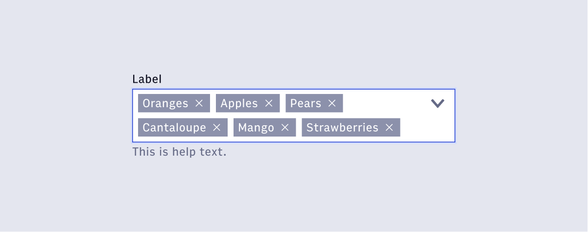
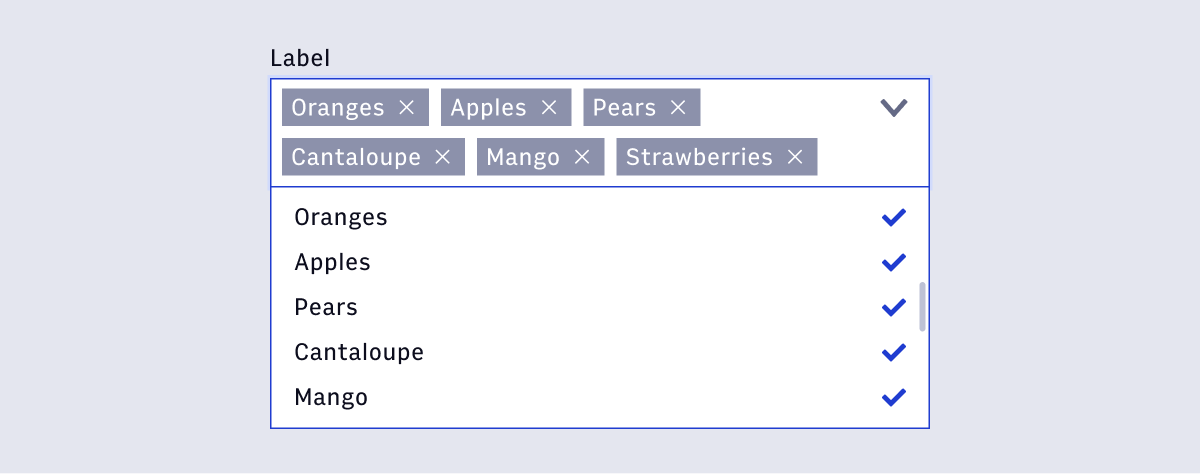
The multi-select dropdown follows the exact same structure as the regular single-select version, with the added ability to select multiple values from a list at one time. Multiple selections are denoted through the active states within the list and the Chiclet components inside the input selector. Multiple Chiclets are grouped into a truncated link when necessary.
- Usage
- React
Component structure
- Chiclet
- Truncation Link
Chiclet
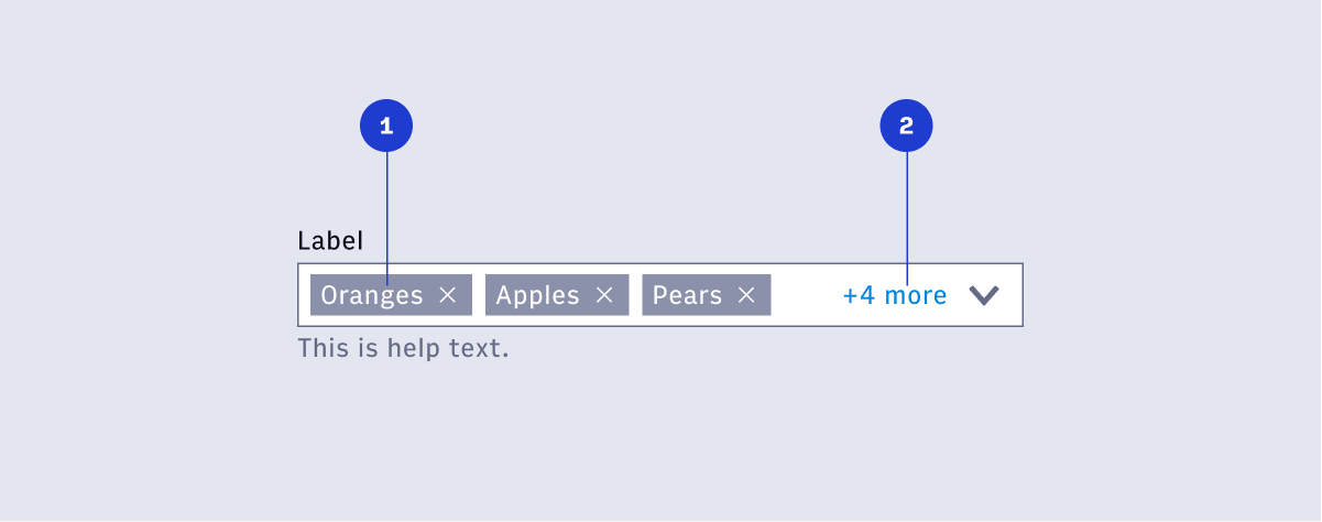
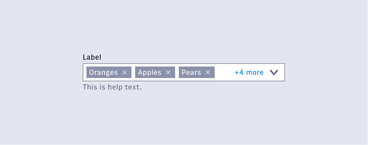
The Chiclet component is used to signify an active selection within the list. Chiclets appear in the order they were selected from the list. The user can quickly remove a selection by removing the Chiclet via the interactive X icon.
Truncation link
When the number of Chiclets exceed the width of the input, they are truncated into a clickable link element denoting the number of selections left. Clicking the link should vertically expand the input field to reveal all selections. Activating the dropdown should also reveal selections in the same manner.
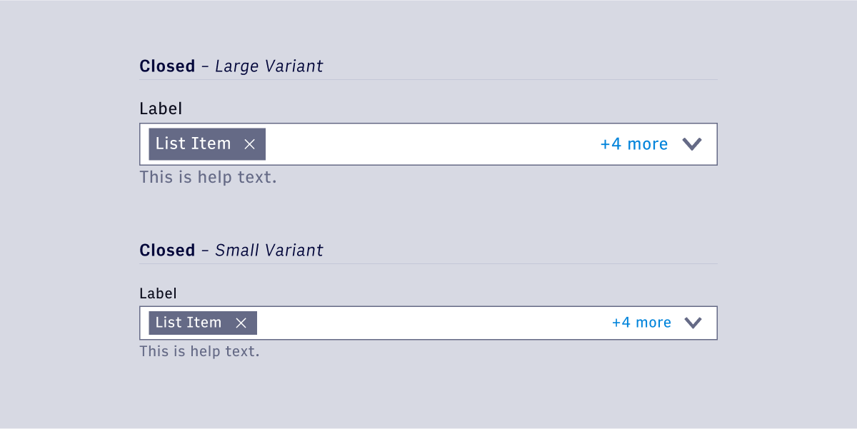
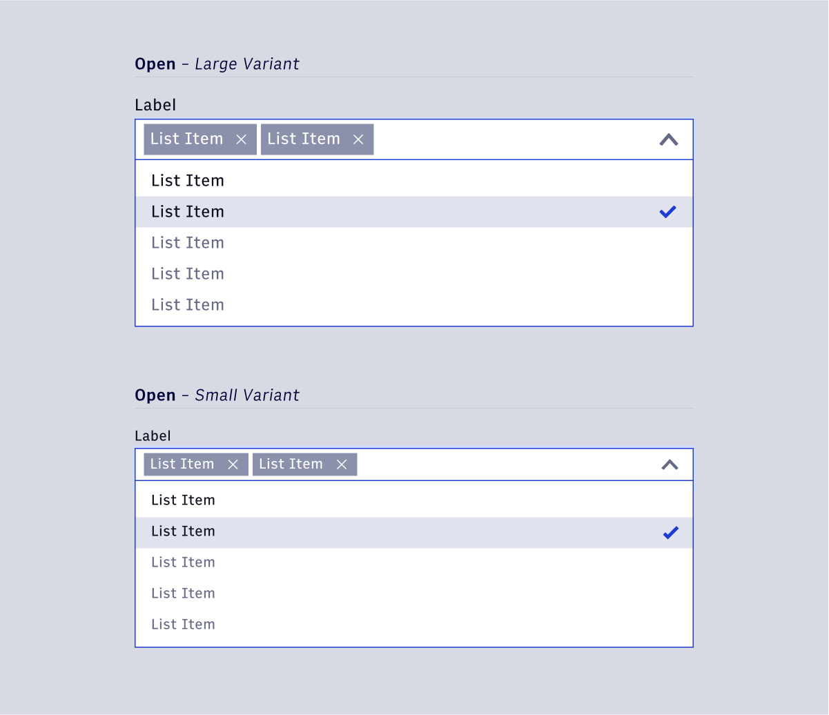
Size Variants
Like the regular single select version, multi-select dropdowns have a large and small variant. Large variants use the large body copy styling for text elements and large icon sizing (24px) for icon elements, as well as the large Chiclet size. Small variants use the small body copy styling for text elements, small icon sizing (16px), and the small Chiclet size.
Multi