Pagination
Overview
Pagination allows users to view content in digestible amounts and navigate through that content which can be in the form of tables and lists (cards, images, videos). Pagination is typically visible above and/or below a body of content.
Component Structure
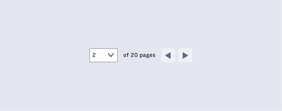
Displaying Pages
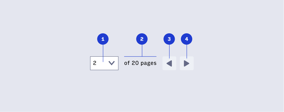
- Dropdown field displaying the current page in view
- Total number of pages, “many”, or “X+”
- Previous button at rest
- Next button at rest
Displaying Search Results
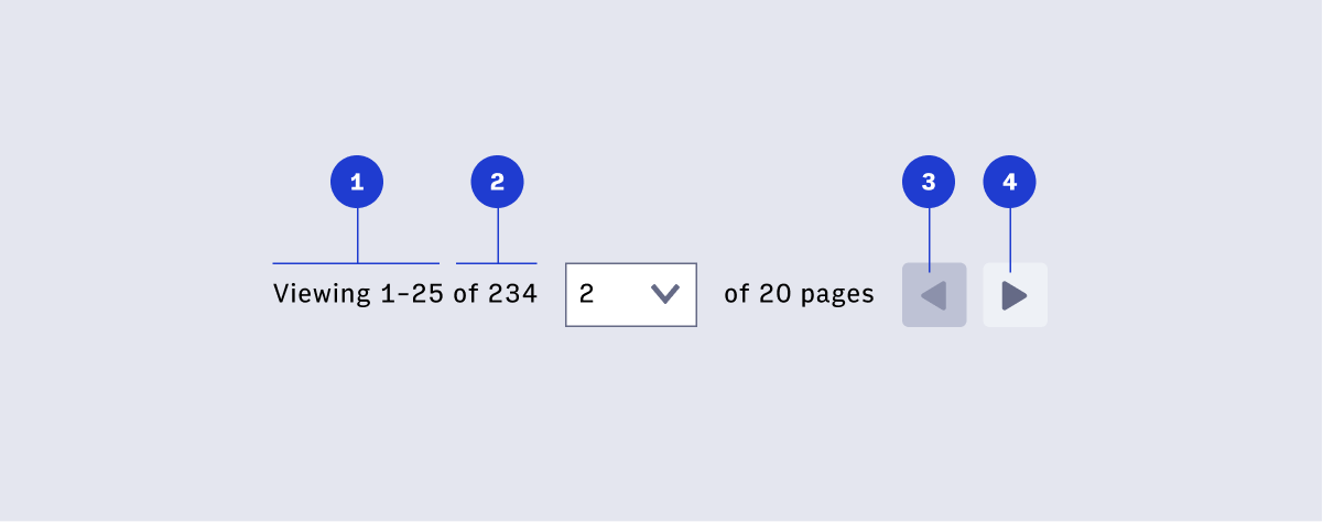
- Items in view
- Total number of items, “of many”, or “X+”
- Previous button disabled
Pages
Display the current page/jump-to page dropdown and total number of pages with navigation when there is more than one page of content.
Search results
Display the items view after a user has conducted a search to the left of the page display or aligned to the other end of the table/list.
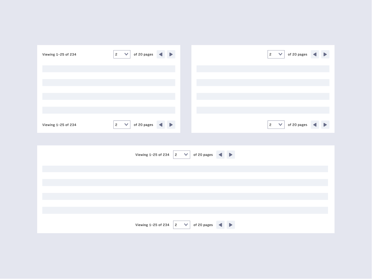
Placement
Page navigation and search result items can be placed above and/or below, aligned to the left/right/center of a body of content depending on the layout. See below for examples of options.
Accessibility
- User understands what page / number of items they are currently viewing (a screen reader needs to be able to read these.)
- User can select a different page to navigate to using the keyboard to control the dropdown (the dropdown needs to be keyboard operable)
- User understands there is a disabled previous button on the first page / set of items (resource: aria-disabled)
- User can navigate left and right via keyboard