Icon Button
Overview
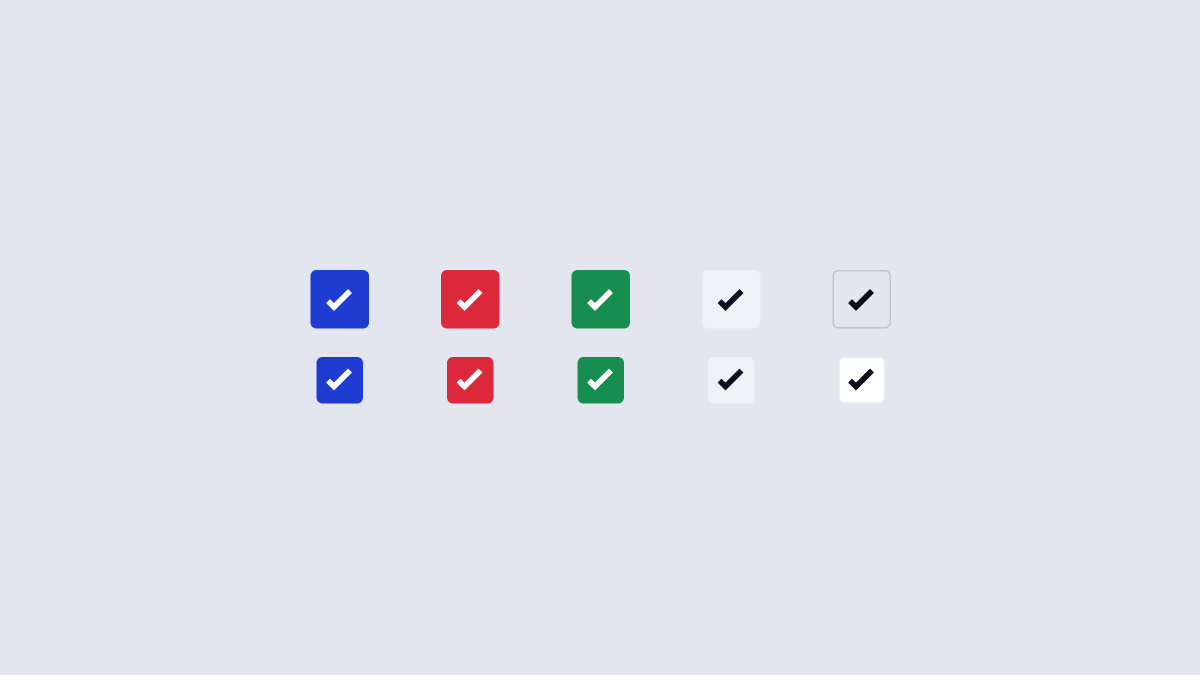
Icon Buttons are buttons within Arc that only have an icon inside. These buttons are used sparingly, but are often required on complex screens.
- Usage
- React
Component structure
- Background container - This is what makes up the body of the button. This also is the hitzone for the button, accomdating touch screen devices.
- Icon - The icon component within the icon button. Read more about icons.
Usage
Icon buttons should be used sparingly, when the experience calls for a button that occupies less visual real estate. When considering whether an icon button is appropriate, visit these key tips:
Do
- Use the various button types & best practices.
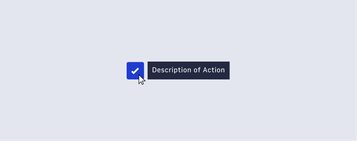
- All icon buttons must be paired with a tooltip. This is critical for building our users’ visual vocabulary, while also providing context. Some icons may not be inherently understandable without the tooltip.
- Use button states (ex. Using an icon button for delete should be red, since it is a destructive action). See button states.
- For the icons inside the button, do not detach the coupled
SVG title. This is important for screen readers. Generally, theSVG titleshould also match the tooltip.
Don't
- Change any color of SVGs. SVGs inherit fill, hover, and other properties based on the parent element.
Accessibility
Keyboard Interactions:
When the button has focus:
- Space: Activates the button.
- Enter: Activates the button.
- Following button activation, focus is set depending on the type of action the button performs. For example:
- If activating the button opens a dialog, the focus moves inside the dialog.
- If activating the button closes a dialog, focus typically returns to the button that opened the dialog unless the function performed in the dialog context logically leads to a different element. For example, activating a cancel button in a dialog returns focus to the button that opened the dialog. However, if the dialog were confirming the action of deleting the page from which it was opened, the focus would logically move to a new context.
- If activating the button does not dismiss the current context, then focus typically remains on the button after activation, e.g., an Apply or Recalculate button.
- If the button action indicates a context change, such as move to next step in a wizard or add another search criteria, then it is often appropriate to move focus to the starting point for that action.
- If the button is activated with a shortcut key, the focus usually remains in the context from which the shortcut key was activated. For example, if Alt + U were assigned to an "Up" button that moves the currently focused item in a list one position higher in the list, pressing Alt + U when the focus is in the list would not move the focus from the list.
WAI-ARIA roles, states, and properties:
- The button has role of button.
- The
buttonhas an accessible label. By default, the accessible name is computed from any text content inside the button element. However, it can also be provided with aria-labelledby or aria-label. - If a description of the button's function is present, the button element has aria-describedby set to the ID of the element containing the description.
- When the action associated with a button is unavailable, the button has aria-disabled set to
true.
Sources:
https://www.w3.org/TR/wai-aria-practices/#button
https://www.w3.org/TR/wai-aria-practices/#wai-aria-roles-states-and-properties-3