# OverviewOne primary goal of the design system is for components to not affect anything outside of itself--components should be usable in any context or layout.
By using a stack, Arc UI can create simple but common flex layouts without components needing to be aware of where they are placed in a layout. Also, using stacks can help limit space between elements to be from the Arc UI spacing scale.
# ImportCopy import { VStack , HStack } from '@wpmedia/arc-ui-layout'
# UsageStack is best used sparingly, when elements require a consistent spacing among the other children.
# Vertical stacksWhen placing elements into a vertical stack, use the component VStack.
< VStack >
< Box bg = " purple.400 " height = " 50px " width = " 75px " />
< Box bg = " purple.400 " height = " 50px " width = " 75px " />
< Box bg = " purple.400 " height = " 50px " width = " 75px " />
</ VStack >
# Horizontal stacksWhen placing elements into a horizontal stack, use the component HStack.
< HStack gap = " xxsmall " >
< Button > Cancel </ Button >
< Button variant = " primary " > Submit </ Button >
</ HStack >
# Nested stacksStacks can be nested to create simple layouts.
< VStack >
< Box width = " 100% " height = " 50px " bg = " purple.500 " />
< Box width = " 100% " height = " 50px " bg = " purple.500 " />
< HStack justifyContent = " flex-end " >
< Button > Action </ Button >
< Button > Another one </ Button >
</ HStack >
</ VStack >
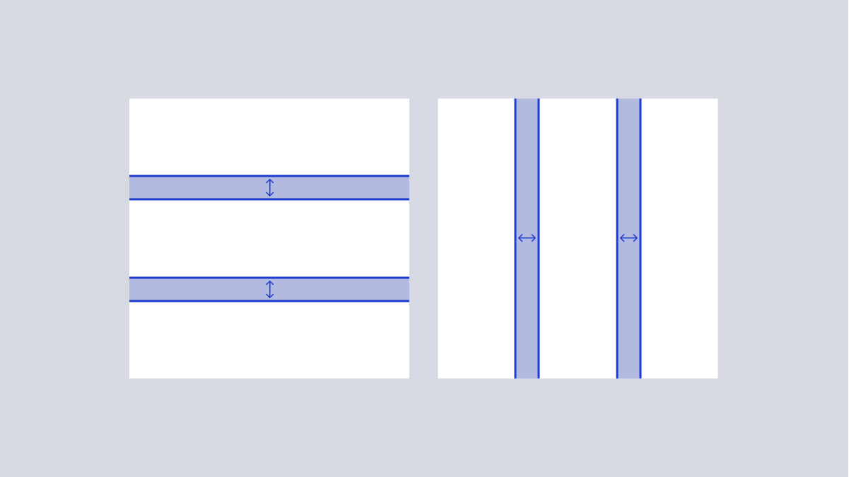
# Adjusting stack spacingSpacing is unique to the use case. The components accept a spacing token via the gap prop.
< HStack gap = " xxlarge " >
< VStack gap = " xsmall " >
< Box bg = " purple.400 " height = " 50px " width = " 100px " />
< Box bg = " purple.400 " height = " 50px " width = " 100px " />
< Box bg = " purple.400 " height = " 50px " width = " 100px " />
</ VStack >
< VStack gap = " medium " >
< Box bg = " red.400 " height = " 50px " width = " 100px " />
< Box bg = " red.400 " height = " 50px " width = " 100px " />
< Box bg = " red.400 " height = " 50px " width = " 100px " />
</ VStack >
< VStack gap = " xlarge " >
< Box bg = " green.400 " height = " 50px " width = " 100px " />
< Box bg = " green.400 " height = " 50px " width = " 100px " />
< Box bg = " green.400 " height = " 50px " width = " 100px " />
</ VStack >
</ HStack >