Select - Single 🚧
Overview
Dropdowns allow users to choose options from a list. In general, dropdowns should be used when the user is presented a list of more than 8 choices. If there are less than 8 choices, consider using the Checkbox component instead. There is no maximum size on the list of choices, but we generally recommend to keep it under 30.
- Usage
- React
Component structure
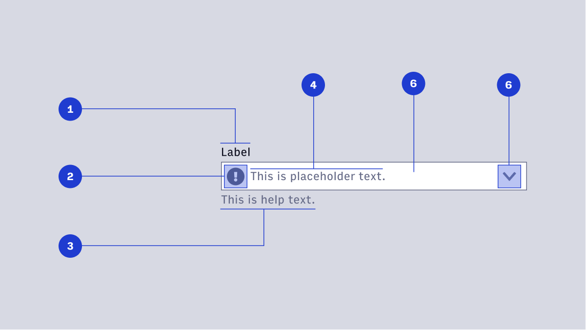
- Label
- Display Icon (optional)
- Help Text (optional)
- Placeholder Text (optional)
- Container
- Interactive Icon
Label
Label text is used to inform users as to what information is requested for a text field. Every text field should have a label.
Display icon
A Display Icon can describe the type of input a text field requires, and be touch targets for nested components. For example, a calendar icon may be tapped to reveal a date picker.
Help text / error message
Help Text conveys additional guidance about the input field, such as how it will be used. It should only take up a single line, being persistently visible or visible only on focus. Error messages will take the place of Help Text when necessary, see Error Handling for more information.
Placeholder text
Placeholder Text can be used literally describe the action to be taken by the user, or provide an input example. For example, “Enter name” or “John Doe” for a text field that requires a name.
Container
Like text fields, the container width should extend far enough to contain about 60-70 characters on a single line before wrapping. Vertical height should remain static at 39px. There should be no border-radius on any dropdown selector.
Interactive icon
An Interactive Icon is an optional icon that should always have an action tied to it. For example, a magnifying glass to signify a search action, or caret to indicate a dropdown.
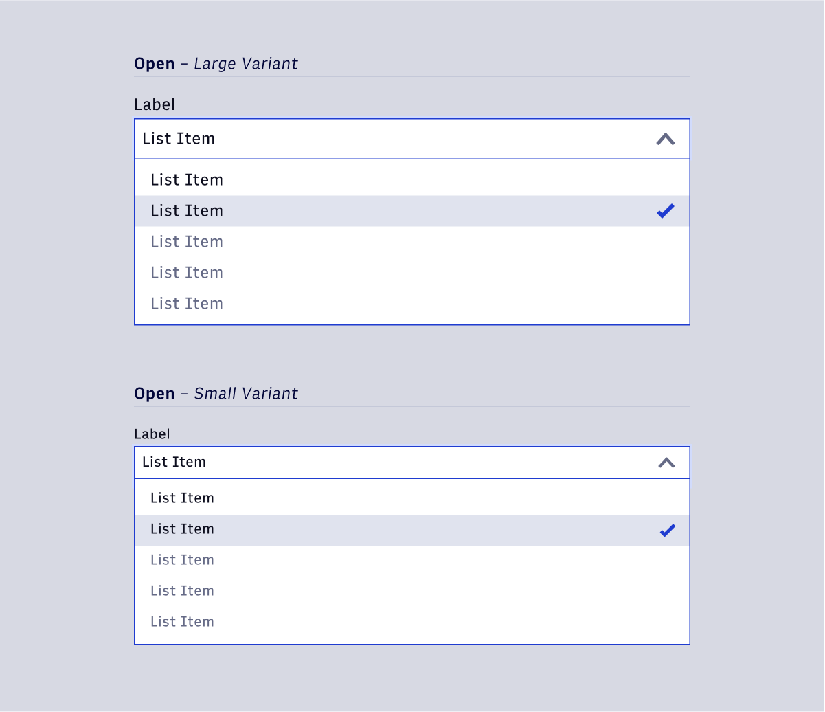
Open / Focus state
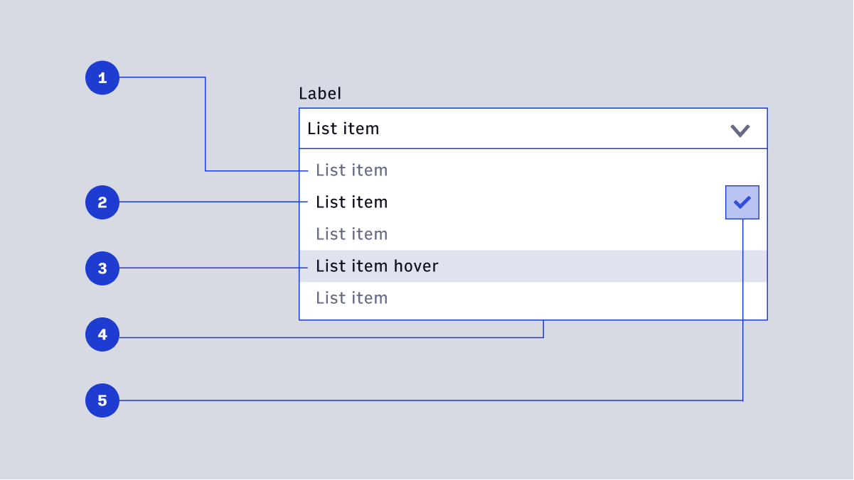
- List Item (default)
- List Item (active)
- Hover State
- List Container
- Selection Icon
List item (default)
The default style list of selection items. Items should be concise and never extend to two lines. Text color is Gray 500 for non-active list items.
List item (active)
When an item is selected, the text color changes to \$arc-default-text. Active items are paired with an icon (see below).
Hover
On hover, the background color on a row containing a list item changes from transparent to $arc-gray-100. The list item text color changes to $arc-default-text.
List container
The container should be tall enough to contain at least 5 list items before scrolling. The container will cover any help text or validation messaging.
Selection icon
A small checkmark to indicate an item is selected. Default color is set to \$arc-purple-500.
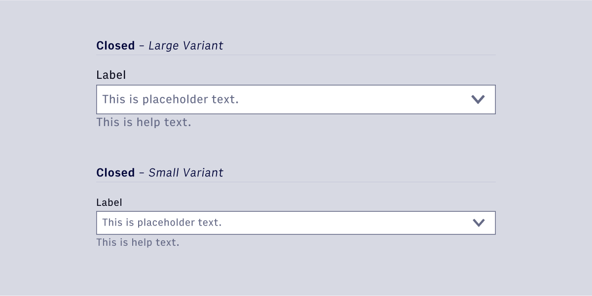
Size Variants
Dropdowns have a large and small size variant. Large variants use the large body copy styling for text elements and large icon sizing (24px) for icon elements. Small variants use the small body copy styling for text elements and small icon sizing (16px).