Button
Most of Arc’s interfaces incorporate buttons allowing users to take actions. They need to be discernible from the rest of a view's content, show some form of feedback from user actions, and need to provide some indication of what the user should expect if clicked.
- Usage
- React
note
The Button component does not yet support all the variants shown in the "Usage" tab.
Import
import { Button } from '@wpmedia/arc-ui-button'Usage
interface ButtonProps
| Props | Description |
|---|---|
iconName(optional) | "ellipsis" | "warning" | "success" | "danger" | "publish" | "filter" | "filterWebsite" | "trash" | "arrowUp" | "arrowDown" | "arrowLeft" | "arrowRight" | "checkmark" | "close" | "copy" | "editDisplaySettings" | "expandArea" | "focalPoint" | "gridView" | "gridViewLarge" | "gridViewMedium" | "gridViewSmall" | "listView" | "maximizeGroup" | "minimizeGroup" | "moveToBeginning" | "moveToEnd" | "moveToGallery" | "removeImage" | "coverImage" | "openColorPicker" | "search" | "add" | "addInternalNote" | "chevronDown" | "chevronLeft" | "chevronRight" | "chevronUp" | "date" | "download" | "duplicate" | "edit" | "gallery" | "help" | "hide" | "photo" | "pitch" | "playController" | "playThumbnail" | "preview" | "refresh" | "settings" | "task" | "time"Name of the desired icon. |
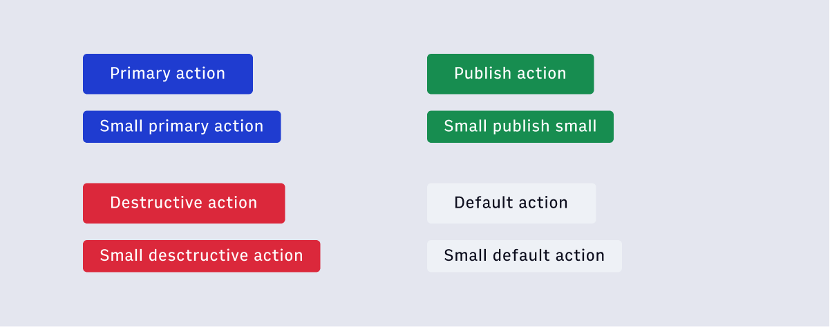
small(optional) | undefined | false | true = falseUse smaller font size. |
variant(optional) | "primary" | "destructive" | "default" | "publish" | "ghost" = defaultColor variation and intent. |
Copy
Buttons with Icons
Use the iconName prop to add an Icon to a Button component.
note
When looking to create buttons with icons but without text, refer to the IconButton component.
Copy