Card 🚧
Overview
 Cards group related information in a flexible-size container. A card will represent a subject, such as a piece of content, and display information relevant to the user about that subject. Cards often provide an entry point to further details on their subject.
Usage
- Display content composed of different elements or data types (photos, videos, text, ect.)
- User to browse through or explore the content, instead of just scanning (tables are better for scanning).
- Show a preview of what the card represents in relationship to other content. Users can elect to view more detailed information by interacting with the card.
Card design guidelines
- Determine the hierarchy of content on the card clearly.
- Single subject for the card. A card should not represent more than one idea or object.
- Avoid unnecessary borders and drop shadows. Use the elevation to show when a card is being interacted with (drag and drop for example).
- Most important elements of a card (often and image or headline) should be in the upper area of a card and left justified. Consider how the card would work if right justified for internationalization purposes.
- Use design system spacers to define space between content elements. The card’s container has padding of 16px/1rem. Additional spacing may be accounted for with margins on the content as needed.
- Divider lines (1px, solid, Gray300) can be used to break up content.
Component structure
This is an example of a card. Layouts and content will likely be far different depending on the needs of the design.
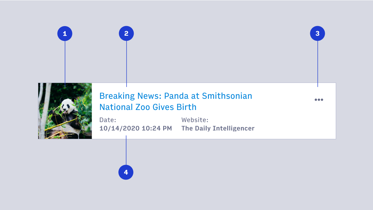
- Image
- Title or headline
- Overflow menu
- Detailed information
Spacing and padding
It’s recommended to use small sized (16px/1rem) padding around the container of a card to maintain consistency across Arc. Different spacers can be used to separate content in the card. Designers should start with small sized (16px/1rem) spacing and adjust as needed.
Card behavior
Card size and layout changes should be designed to accommodate different devices and viewports.
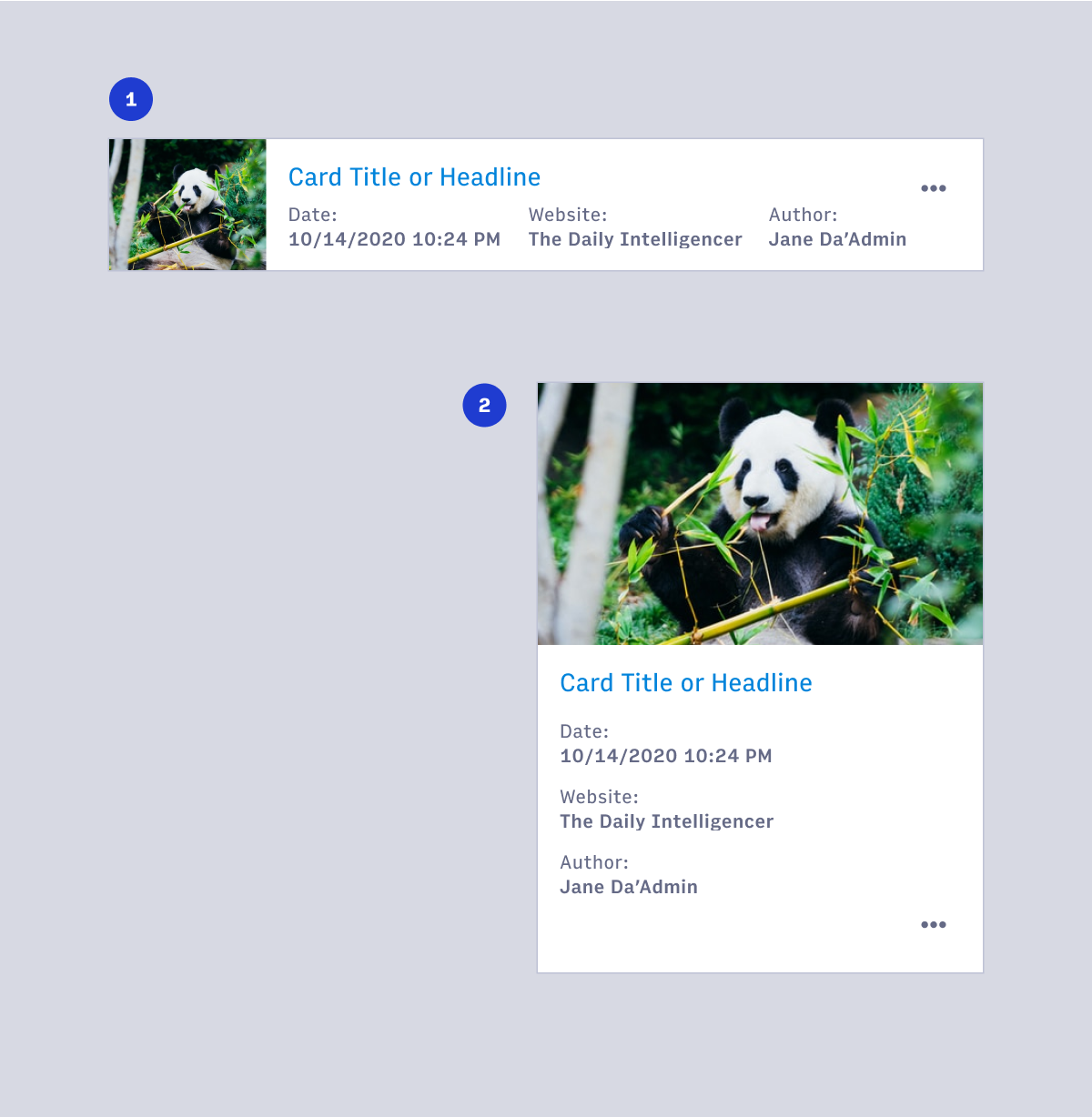
- Desktop card
- Mobile, tablet or small viewport card
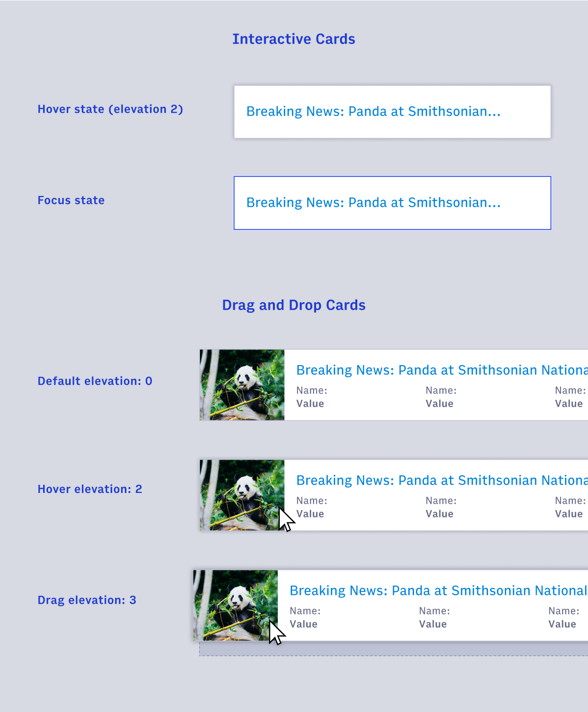
Card hover and focus states
Card design should capture how to fit in these different layouts.
Default elevation for a card is 0, hover and drag change the elevation to reinforce the cards interaction. Cards which are fully interactive should include hover and focus state.
Card examples
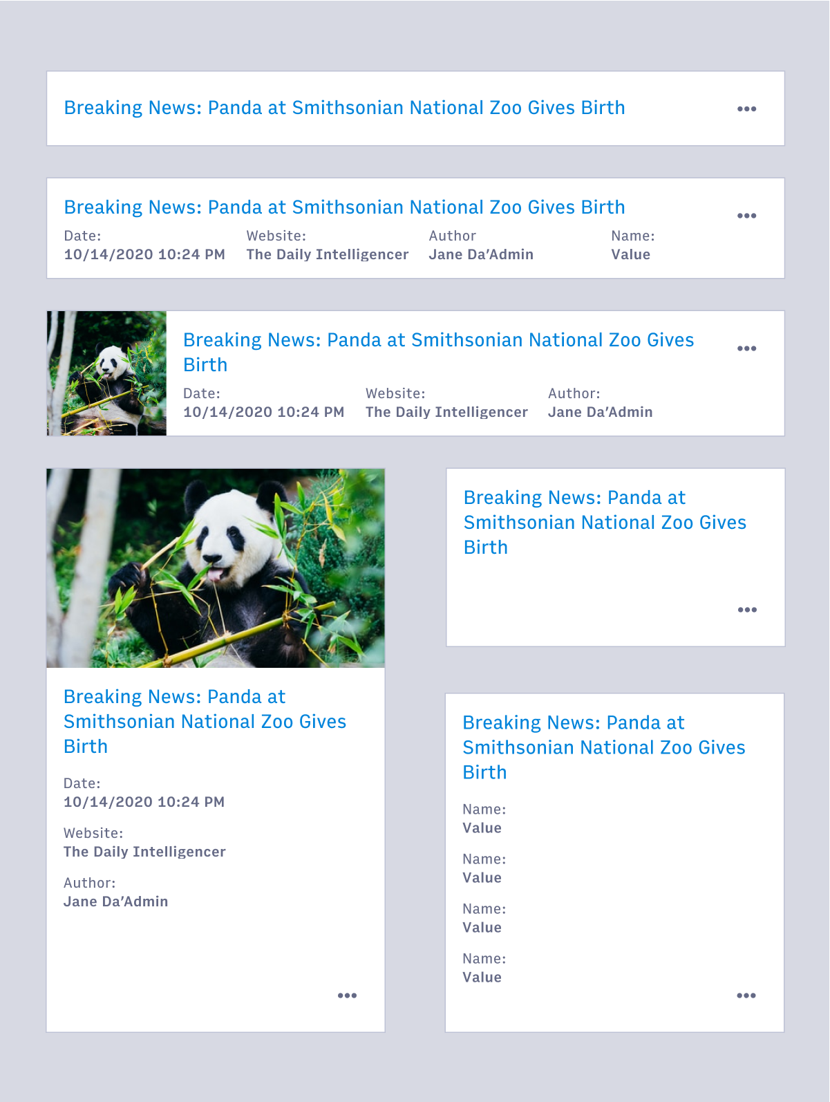
There are several different configurations available for cards using the Figma component. Additionally there are components for different layouts of cards to represent how the card responds to responsive pages.
Cards are designed to be flexible to fit content needs. These are general guidelines and may not be applicable to every situation. Card component examples in Figma may be used as a starting point, detached from their parent, in cases where the designer would like to accomplish something the original component cannot.
Cards & tables
Cards and tables share many properties and interactions but there is a right time to use each.
When to use cards
- When there is a large amount or many types of information to be displayed (images, headlines, and badges for example).
- When you want the user to browse content instead of scanning for specific information.
- When screen real-estate is less important than information hierarchy.
- When visual impact is important for the display of information.
When to use tables
- When the primary task is to compare different but related objects with nearly identical data points.
- When there are fewer or shorter data points in the information.
- When users need to manipulate tabular information. Adding or removing columns as needed, or sorting and filtering as a primary action for the user (Note: sorting and filtering can apply to lists of cards as well).
- When simple and clean display of information with little hierarchy and variation is needed.
Accessibility
- Use list markup to group your cards
- Make sure your cards don't break when lines of content wrap or images don't meet specific aspect ratio requirements
- Avoid too much functionality and reduce tab stops. Cards shouldn't be miniature web pages.
- Remember that headings should begin sections. Most everything that belongs to the section should follow the heading in the source.
- (source: https://inclusive-components.design/cards/)