Button group 🚧
Overview
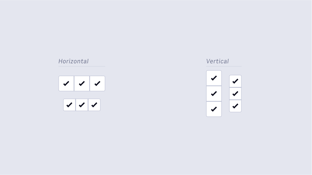 Button Groups are a grouping of two or more Icon Buttons in a horizontal row or vertical column. Button Groups should be used for Icon Buttons that are in close proximity to one another or are closely related in some way (e.g. a filter to switch between different view types on a page, or a compact nav bar).
Button Groups are comprised of multiple Icon Buttons, and therefore should inherit all default properties and follow the same usage guidelines.
Accessibility
Keyboard Interactions:
When the button has focus:
- Space: Activates the button.
- Enter: Activates the button.
- Following button activation, focus is set depending on the type of action the button performs. For example:
- If activating the button opens a dialog, the focus moves inside the dialog.
- If activating the button closes a dialog, focus typically returns to the button that opened the dialog unless the function performed in the dialog context logically leads to a different element. For example, activating a cancel button in a dialog returns focus to the button that opened the dialog. However, if the dialog were confirming the action of deleting the page from which it was opened, the focus would logically move to a new context.
- If activating the button does not dismiss the current context, then focus typically remains on the button after activation, e.g., an Apply or Recalculate button.
- If the button action indicates a context change, such as move to next step in a wizard or add another search criteria, then it is often appropriate to move focus to the starting point for that action.
- If the button is activated with a shortcut key, the focus usually remains in the context from which the shortcut key was activated. For example, if Alt + U were assigned to an "Up" button that moves the currently focused item in a list one position higher in the list, pressing Alt + U when the focus is in the list would not move the focus from the list.
WAI-ARIA Roles, States, and Properties:
- The button has role of button.
- The
buttonhas an accessible label. By default, the accessible name is computed from any text content inside the button element. However, it can also be provided with aria-labelledby or aria-label. - If a description of the button's function is present, the button element has aria-describedby set to the ID of the element containing the description.
- When the action associated with a button is unavailable, the button has aria-disabled set to
true.
Sources:
https://www.w3.org/TR/wai-aria-practices/#button
https://www.w3.org/TR/wai-aria-practices/#wai-aria-roles-states-and-properties-3