Alert dialog 🚧
Overview
A dialog is a type of modal window that appears in front of app content to provide critical information or ask for a decision. Dialogs should always be in response to a user action and should never appear unprovoked.
Dialogs open in the center of the viewport and disable all app functionality when they appear, and remain on screen until confirmed, dismissed, or a required action has been taken.
 Dialogs should always appear in response to an action taken on the page.
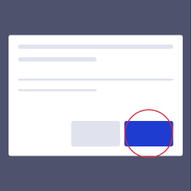 Dialogs should open in front of all app content in the center of the viewport.
 Dialogs should require an action to be taken before proceeding/closing.
Component structure
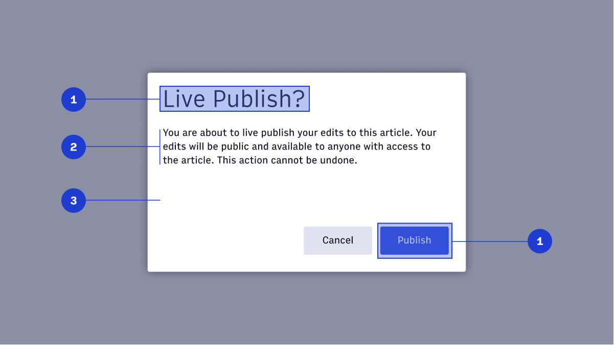
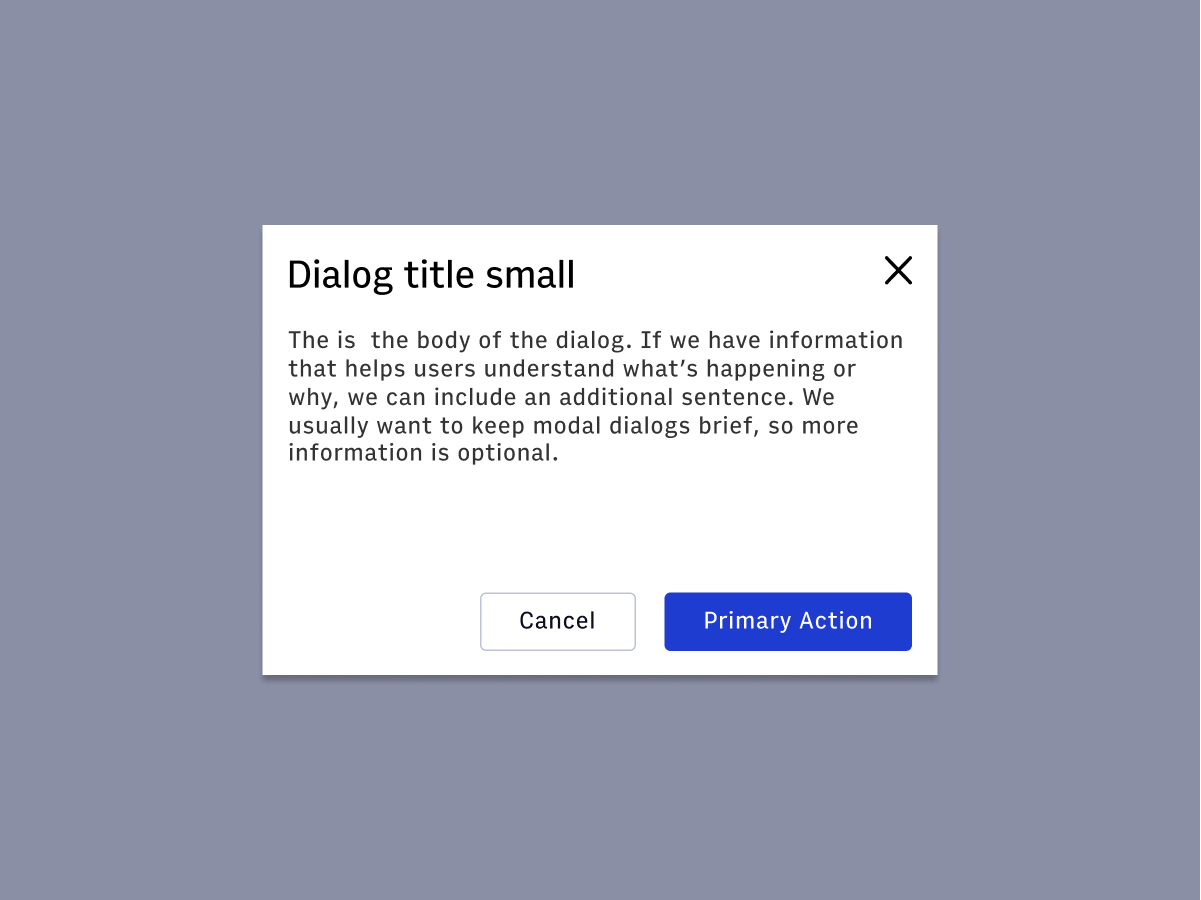
1. Title
The title uses the {type-class} and should be used to confirm the action being attempted. No more than two lines of text for titles.
2. Supporting text
Supporting text length is much more flexible when using dialogs. Short and concise is always preferable but there is room to be a little more verbose if needed. Aim for 2-3 sentences ideally, 5-6 sentences max.
3. Container
The container should use a min-width of {value} and a max-width of {value}. These are the default values set by {react-component-name}. Refer to Usage for code examples.
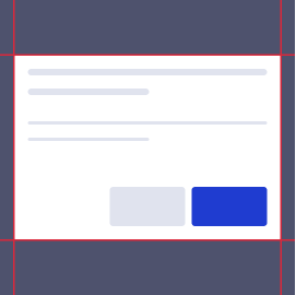
4. Buttons
Like alerts, dialogs require acknowledgment before closing. A dialog should have a {primary-button} that serves as final confirmation for the action being attempted. A dialog may optionally feature a {secondary-button} to dismiss the modal.
Usage
Dialogs are classified as high urgency. Dialogs require an action to be taken before proceeding, and are highly and purposefully interruptive to the user experience. Use them sparingly.
| Component | Urgency | Content | Behavior | Actions | Example |
|---|---|---|---|---|---|
| Snackbar | Low | Informational | Transient (3-10 seconds) | 0-1 | Featured added, "Successfully updated a shared draft" |
| Alert | Medium | Awareness of state | Persistent, nonmodal, dismissable | 1-2 | Your page has been successfully published |
| Alert dialog | High | Require a choice/acknowledgement | Persistent, modal, dismissable | 1-2 | Are you sure you want to use the shared draft? |
Default
The default Snackbar should communicate neutral information about the system.
Accessibility
- Set the user focus on the Dialog when it appears so that the screen reader will immediately read the information to the user.
- Set user focus on Dialog close action.
- Generally, focus should be set back to the point where the action was taken so that the user doesn’t orientation isn’t disrupted.
- Some workflows may need different focus management.
- Keyboard support is needed.
- Tabbing and arrows will not work outside of the dialog while the Dialog is active.
- Focus may be set to the tabbable object which is most likely the user’s next action (such as a confirmation button).
- Do not use
role=``"``alert``"for Dialogs. The focus set to the dialog will read it to the user, and the role change will cause the dialog to be read twice. Userole=``"``alertdialog``"instead. - ESC key should close the dialog.
- https://www.w3.org/TR/wai-aria-practices/examples/dialog-modal/alertdialog.html
Sources
- https://webaim.org/techniques/formvalidation/
- https://www.deque.com/blog/inclusive-design-tips-presenting-information-multiple-ways/
- https://www.w3.org/TR/wai-aria-practices/#alert
- https://www.w3.org/TR/wai-aria-practices/examples/alert/alert.html
- https://www.w3.org/TR/wai-aria-practices/#dialog_modal
- https://www.w3.org/TR/wai-aria-1.1/#alertdialog