
Arc Design System 1.5.0
This release brings more infrastructure changes, new React components, and several new design patterns. This release also includes several updates to existing components and patterns.
- React Components
- new IconButton
- new Stack
- new Frame
- new Page
- new Sidebar
- Design
- new Work Bar
- new Small form fields
- new Skeleton pages
- new Card
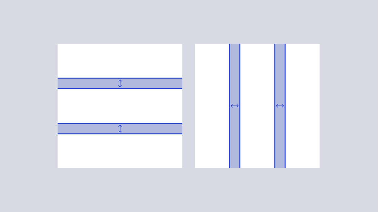
- updated Spacing scale
- updated Type scale
Infrastructure updates
Moving to GitHub Packages
The biggest change in this release is the migration away from Artifactory and onto GitHub Packages. While the versions on Artifactory will remain, they will no longer be updated and will be marked as deprecated.
Beta Releases
With this release and moving forward, beta versions of all packages will be available. Beta versions are released under the NPM @beta tag and represent the current state of the dev branch in the WPMedia/arc-ui repository.
E.g.,
npm install @wpmedia/arc-ui-button@betaReact Components
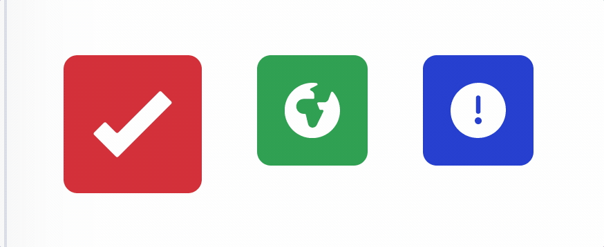
Icon Buttons
Icon buttons are buttons within Arc that only have an icon inside. These buttons are used sparingly, but are often required on complex screens.
Page Layout
Page layouts simplify the process of creating overall page layouts that standardize size and spacing as well as account for the ArcNav and sidebars.
This release adds three page layout components:
- Frame - top level page layout plus ArcNav
- Page - spacing to account for page body and sidebar
- Sidebar - fixed width container that can optionally be included with
Page
These components are intended to be used together to easily structure common page layout variations described the foundation documentation.
Stack (HStack and VStack)
Convenience components for creating simple modular layouts where elements are laid out in a single direction with consistent spacing between them. This can be tedious to do manually with CSS flexbox.
Stacks also help the design system follow a pattern where individual components are not aware of external spacing and layout.
Design
Work Bar
The Work Bar communicates the status of an object, and surfaces key controls to the user. The Work Bar enables users to move through an application with a clear understanding of the status of what they are working on and the primary actions associated.

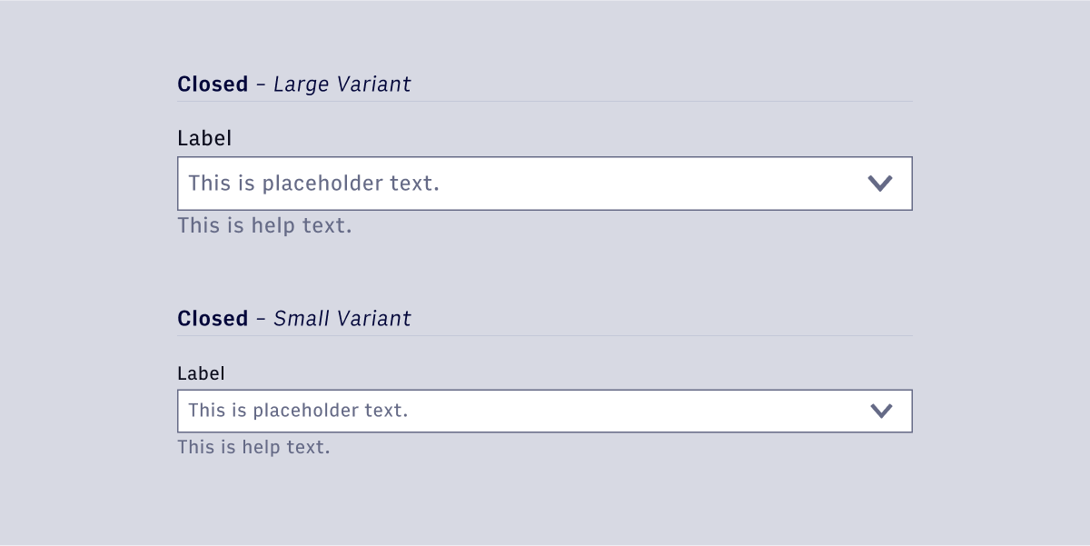
Small Form Fields
Small variants have been added to several form field components.
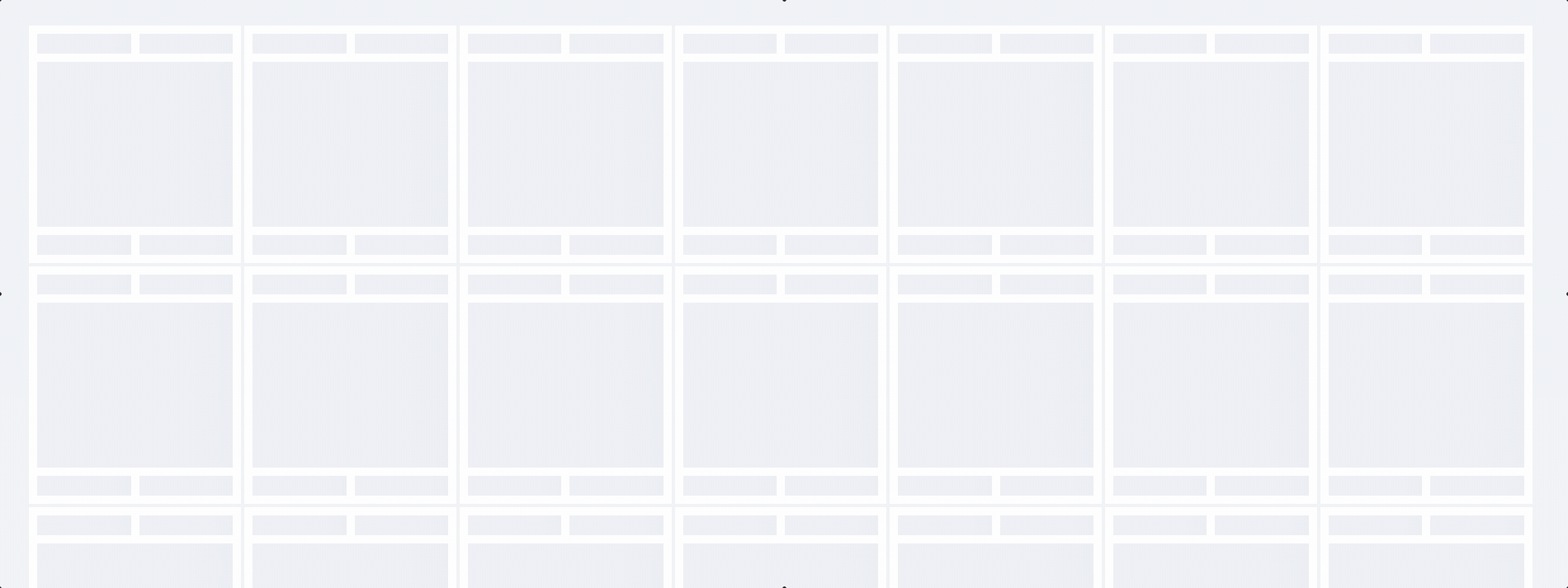
Skeleton Page
Skeleton pages are a useful pattern for pages where there is a lot of content that may be slow to load. The goals of a skeleton page are to hold the layout, while communicating to the user that content is being fetched and loaded.
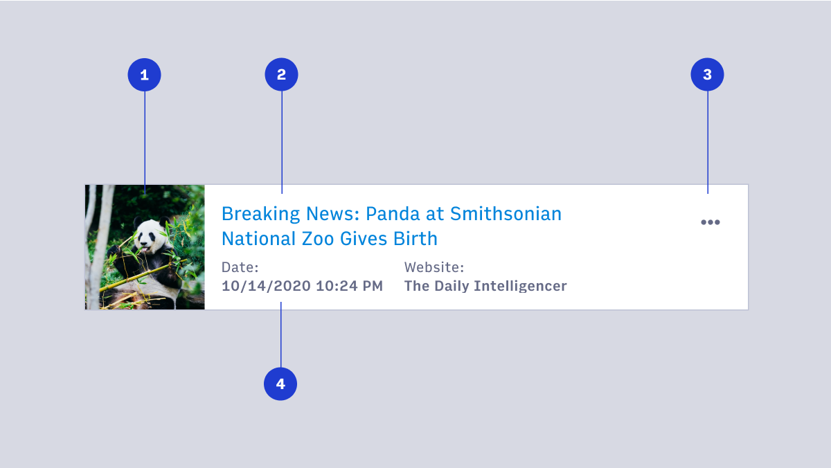
Card
Cards group related information in a flexible-size container. Cards often provide an entry point to further details on their subject.
What are we working on now?
- Work Bar React component
- Arc Navigation 2.0
- Arc integration components (Image Search)
- Single select React component
- Website selection / presentation of selected websites
- Checkbox and radio button React components
Questions? Reach out on #ads-support on Slack.
