
Arc Design System 1.4.0
This release brings small updates to existing components, the Bootstrap theme and design documentation. This release also includes several new design patterns.
- React Components
- updated
AlertAction-@arc-ui/notification@0.2.0 - updated
Icons-@arc-ui/icon@0.1.1 - updated SCSS and Bootstrap variables -
@arc-ui/theme@1.3.0
- updated
- Guidelines
- new Badges
- new File Upload
- new Revision History
- updated Form Validation
- updated Toggle
React Components
AlertAction
By default every alert action will now close the alert. This can be overridden with the new
preventClose prop on AlertAction.
Icon
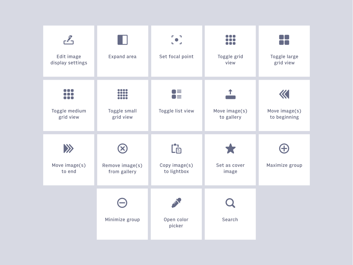
New - We have added 18 paths for use within our Icon react component. You can now also view the full icon library via a Figma embed in the documentation.
Design Guidelines
Badges
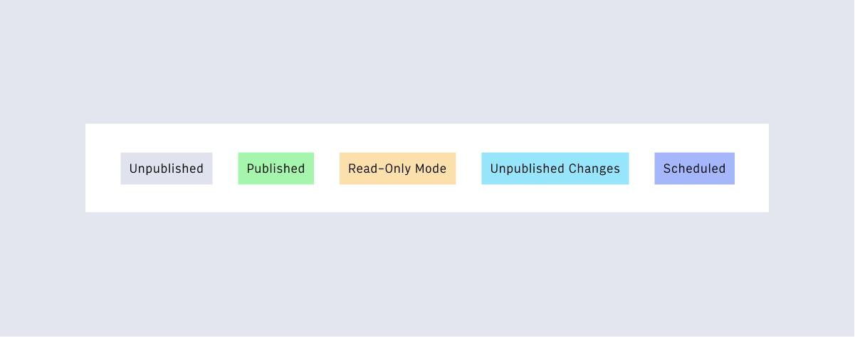
New - Badges use both content & color to communicate states. Throughout Arc Publishing, some common badge states are:
- Unpublished - content is new and has not been published.
- Published - content is published and live.
- Read-Only Mode - another user is currently editing content
- Unpublished Changes - changes have been made that are not yet published.
- Scheduled - content is scheduled for publish.
File Upload
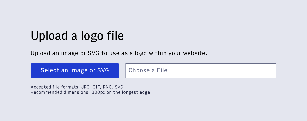
New - In Arc Publishing, our users upload files in many places. This pattern creates an experience that reduces upload friction and errors, by clearly communicating what our system is expecting.
Revision History
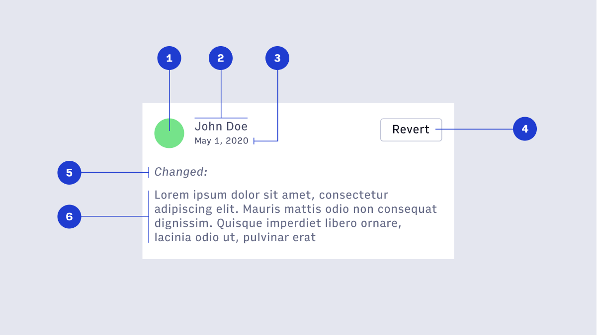
New - Throughout Arc Publishing users create, revise, and publish content. The collaboration during the authoring process requires a robust system for displaying and accessing revision history.
Form Validation
Updated - All required fields should be indicated via (required) tag in the label.
Toggle
Updated - The toggle color was changed from $arc-green-500: #1f3cd0; to $arc-purple-500: #1f3cd0.
What are we working on now?
- Publish / Work Bar
- Arc Navigation 2.0
- React components for all atomic elements
- Small Variants of Form Elements
- Website Selection
- More layout primitives like Stack and Grid
Arc Design System in Action
Want to see the Arc Design System in action? Keep an eye out for these soon-to-be released Arc platform features
- Theme Builder / Theme Settings
- Photo Center Image Landing Page
- Global Settings - Distributors
Questions? Reach out on #ads-support on Slack.
