
Arc Design System 1.3.0
This release brings large internal infrastructure changes, new components, guidelines and an introduction to Zeplin for design/engineering hand-off. See the list below for a quick overview of what changed.
- Infrastructure Updates
- React Components
- new
@arc-ui/button@0.1.0-Button - new
@arc-ui/layout@0.1.0-BoxandFlex - new
@arc-ui/menu@0.1.0-OverflowMenuandMenuItem - new
@arc-ui/notification@0.1.0 - new
@arc-ui/system@0.1.0 - new
@arc-ui/icon@0.1.0 - new
@arc-ui/dialog@0.1.0 - new
@arc-ui/theme@0.1.0 - new
@arc-ui/typography@0.1.0-Text,HeadingandEmoji - updated
AlertButton-@arc-ui/alert@0.1.0 - removed
alertService(replaced byuseNotificationhook) - deprecated
@arc-ui/core
- new
- Guidelines
- new Copy
- new Page Layout
- new Archive
- new Spacing
- new Icon Buttons
- Site updates
- Zeplin Integration
Infrastructure Updates
Individual Component Packages
Previously all components were in the core package. In order to avoid dependency issues as the number of components grows, components are grouped into smaller packages.
@arc-ui/alert-Alert,AlertActionandSnackbar@arc-ui/button-Button@arc-ui/dialog-Dialog,DialogTitle,DialogFooterandDialogBody@arc-ui/icon-Iconand svg paths@arc-ui/layout-BoxandFlex@arc-ui/menu-OverflowMenuandMenuItem@arc-ui/notification-useNotification(replacesalertService) hook andAlertAction@arc-ui/system-ArcThemeProvider,Fonts@arc-ui/typography-Text,Heading,Emoji
The documentation for each component reflects this new structure.
Switch from TSDX to Preconstruct
One pain in moving to separate packages was having to re-build the packages to keep updates between the packages in sync when developing locally. Also, as the number of packages grow, the duration of the build task increases. With the current number of packages, build took 5 minutes to run.
Preconstruct solves these problems when developing locally. Preconstruct links packages together when working locally, in order to avoid the need for re-building. It also batches together the build process to reduce spawning new processes for each package. The development experience significantly improved after making this change.
Playroom
Playroom is a "code-oriented design environment" that lives alongside the Arc UI design system.
- Create quick mock-ups and interactive prototypes with real code.
- Exercise and evaluate the flexibility of Arc UI.
- Share your work with others by simply copying the URL.
See this tweet for a good demo of how it can be used.
https://playroom.arcdesignsystem.com
New React Components
This section highlights only new components added to Arc UI.
Overflow Menu
Included in @arc-ui/menu@0.1.0
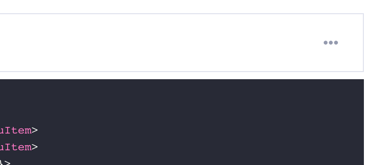
The overflow menu keeps key actions close by in a clean and unobtrusive menu.
Box & Flex
Included in @arc-ui/layout@0.1.0
Box is an abstract component on top of which most other Arc UI components are built. Flex is a Box with display: flex. Using layout primitives like this are common in many design systems:
Future releases of Arc UI will include more layout components like Stack and Grid.
Text, Heading and Emoji
Included in @arc-ui/typography@0.1.0
Both text and heading ensure correct font sizing and spacing for text elements. Text can be used as a substitute for a <p> or <span> tags and Heading can be used as a substitute for a <h1> through <h6> tags.
While working on other parts of the documentation, we realized that raw emojis are not accessible. In order to use emoji usage on this site we added an Emoji component to provide requisite accessibility features.
Button
Included in @arc-ui/button@0.1.0
The Button component in this release does not support the ghost variations.
useNotification
Included in @arc-ui/notification@0.1.0
Provides utilities for managing toast-like messages using the Alert and Snackbar components. This replaces the alertService singleton in @arc-ui/core.
Design Guidelines
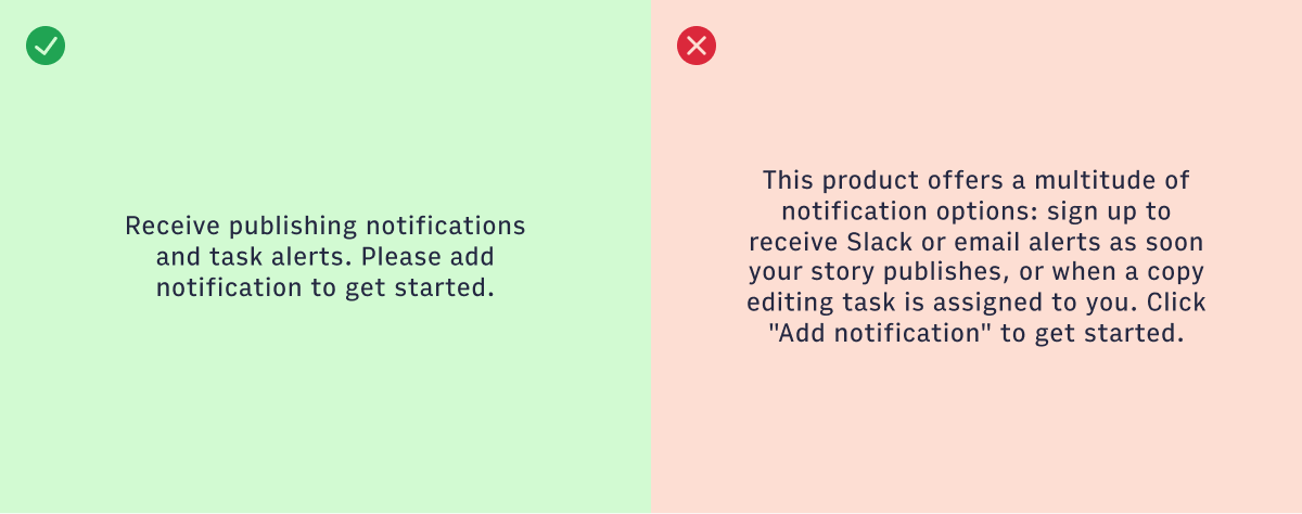
Copy / Content
Copy is everywhere throughout the Arc platform. The words we use on our screens are critical to helping our users do their jobs every day with ease and efficiency.
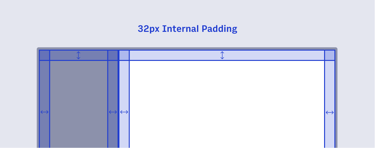
Page Layout
Consistent page layouts create visual structure, helping the user identify key areas of the interface. Arc Publishing has several common layouts and configurations.
Archive
Archiving is the act of removing something from a current view to be organized and managed in a separate view, or an "archive".
Spacing
Using a set spacing scale helps eliminate guesswork regarding the space between and within elements. A spacing scale helps create a smooth, readable flow from page to page.
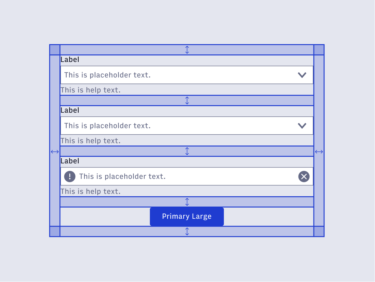
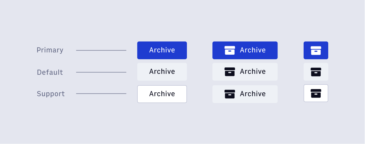
Icon Buttons
Icon Buttons are buttons that pair an icon with a tool tip. These buttons are used sparingly, but are often required on complex screens.
Arc Design System Site Updates
The "Components" section of the sidebar now maps 1:1 to components available in the design system. The 🚧 indicates that the component design specs exist, but the implementation is still in progress. Our goal is to make it clear which components are immediately available for use in a project.
Overarching patterns have been consolidated under the "Guidelines" section.
Zeplin Integration
We have officially migrated from InVision to Zeplin. Zeplin enables engineers to reference the Arc Design System while inspecting design prototypes. We have created an Arc Design System global Zeplin style guide that can be shared across projects. Read more about how to join the Arc account.
What are we working on now?
- Revision History
- Settings Pages
- Copy Glossary
- Cards
- Small Variants of Form Elements
- Distributor Selection Pattern
- More layout primitives like Stack and Grid
Questions? Reach out on #ads-support on slack.
