Arc Design System 1.2.0
What’s Included in the Arc Design System 1.2.0 Release:
React Components:
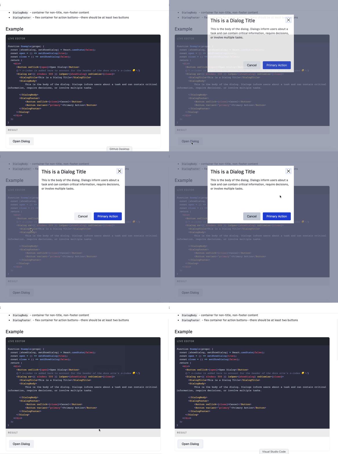
Dialog
The Arc dialog pattern provides the following components: Dialog, DialogTitle , DialogBody , DialogFooter.

Icon
The icon component returns an SVG tag with corresponding icon path and labels.
Design Documentation:
Icons
We have releasted a base set of icons and will continue to add to the available selection over time. In order to ensure that our iconography is purposeful, accessible, and cohesive, the product design team has adopted the Streamline icon family; you can read in detail the thoughts behind this change here.
![]()
Pagination
Pagination allows users to view content in digestible amounts.

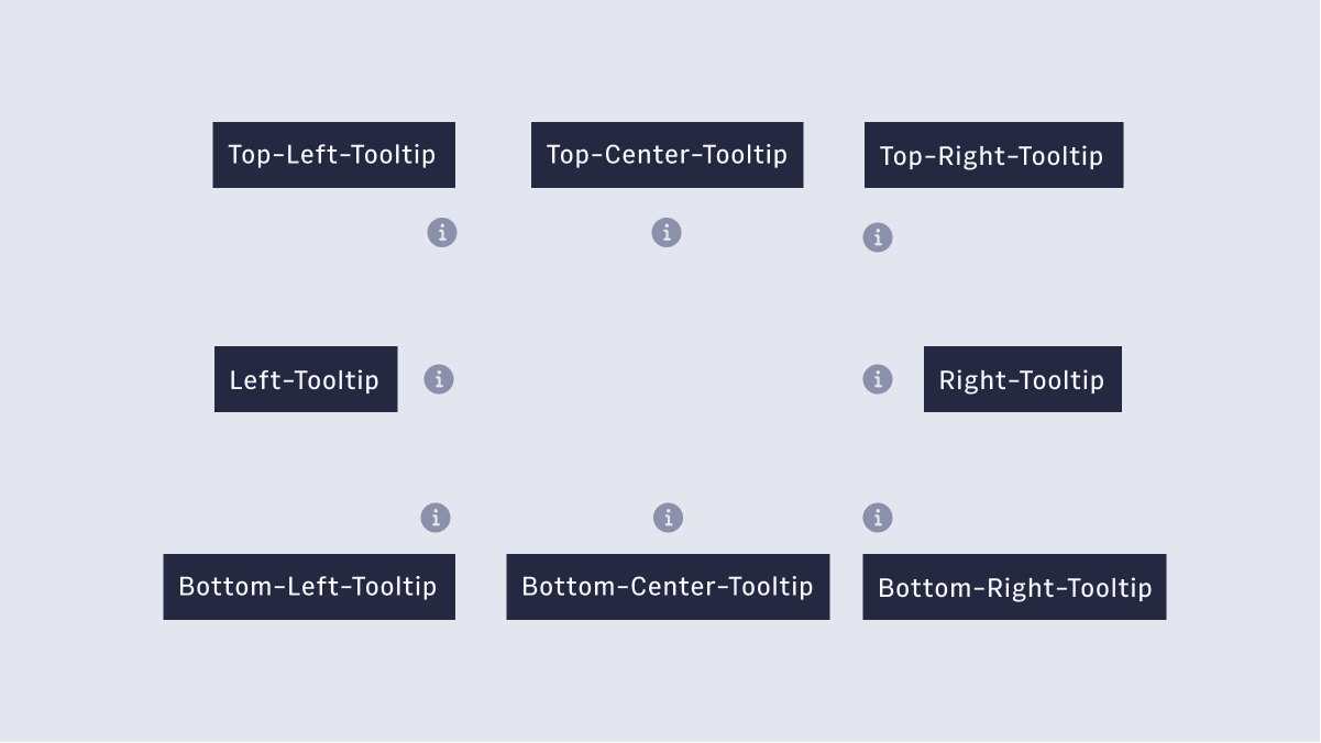
Tooltips
Tooltips are user-triggered messages that provide additional information about a page element or feature.

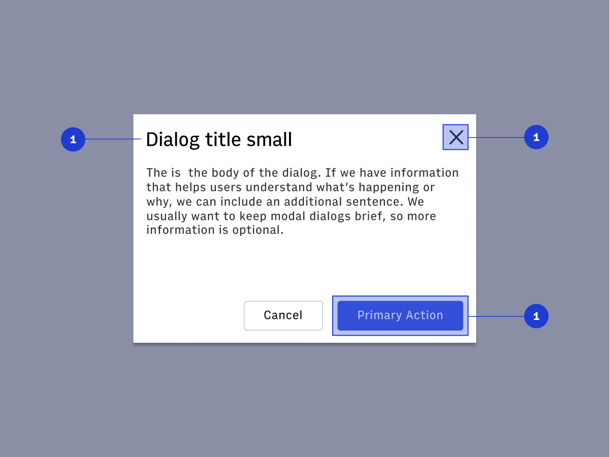
Dialog
A dialog is a conversation between the platform and the user.

What are we working on now?
- Text Field - React Component
- Tables - Component Design
- Breadcrumbs - Component Design
- Archiving - Design Pattern
- Pinning - Design Pattern
- Icon Buttons - Component Design
Questions? Reach out on #ads-support on slack.
